This article is based on the video Is there a better alphabet for English? by RobWords, a YouTube channel known for its smart, funny takes on language and history.
The video asks a surprisingly tricky question: Could English be written more clearly with a different alphabet? Turns out, quite a few people thought so — including Benjamin Franklin, Brigham Young, and a US senator who once helped create the Federal Reserve.
Over the years, these reformers pitched alphabets with more logic, more phonetics, and a lot more letters. Some aimed to make reading easier for children. Others wanted to unite the world under one alphabet. Most of them failed. Gloriously.
In this article, we’ll summarize RobWords’ video, highlight the most fascinating attempts at reinventing the English alphabet, and see which ones were brilliant, which were baffling, and which were just plain cursed.
The Mormon Alphabet You’ve Never Heard Of
Our story begins in 1850, in what would later become Utah, with the Church of Jesus Christ of Latter-day Saints. Freshly relocated and eager to build a better society, Brigham Young looked at the alphabet and decided it needed a makeover.
He wasn’t wrong. English spelling is a trainwreck. Why does the letter “A” sound different in mate, father, man, many, and fall? Young figured kids would learn faster and foreign converts would blend in better if the letters actually made sense.
So he ordered the Board of Regents at the University of Deseret to come up with a brand-new alphabet. And they did. After a few years, they unveiled the Deseret Alphabet: 38 characters, one sound each. Clean. Logical. Impossible to learn.
It was basically phonemic rather than phonetic, meaning each symbol stood for a distinct sound unit, not necessarily a letter. The word “the,” for example, became a single character. Neat, right?
Except it wasn’t actually their idea. Much of the sound system was borrowed from British linguist Isaac Pitman, famous for inventing shorthand. One of the Mormon scholars involved, George D. Watt, had studied Pitman’s work in England and essentially re-skinned it with new symbols. Some of which looked like rotated Latin letters. Others were… anyone’s guess.
The alphabet was even used to publish parts of the Book of Mormon, giving it a slightly magical air. But despite some genuine effort, the Deseret Alphabet never really caught on. Even the most devout found it too much hassle.
So where do we land on this one? Let’s break it down.
- ✅ Pros: Describes English sounds pretty well. Ambitious. Weirdly stylish.
- ❌ Cons: 38 characters. Clunky. Inconsistent design. Hard to learn.
- 🏁 Verdict: 5 out of 10. A noble failure, but still a failure.
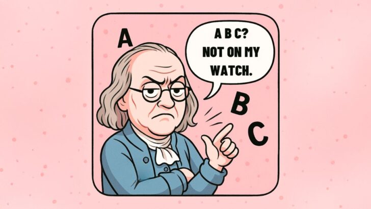
Benjamin Franklin Tried to Fix English Too
Yes, that Benjamin Franklin. The kite guy. The bifocal guy. The Declaration of Independence guy. Turns out, he also hated English spelling.
In the 1770s, Franklin came up with his own alphabet to make English more logical. He called it a way to bring “natural order” to the language. And honestly, he wasn’t completely wrong. His system introduced six new letters to cover sounds that Latin didn’t really care about, including that pesky “uh” sound we use constantly but still haven’t given its own letter.
He even made a new symbol for the word the — just two letters. Not bad. (The Mormons later got it down to one, but hey, baby steps.) He also created different symbols for the two kinds of th sounds: the voiced one in this and the unvoiced one in thing. If you’ve ever learned about the old letters thorn (þ) and eth (ð), this was kind of a modern update on those.
Franklin also gave us symbols for sh and ng, which is more than our current alphabet ever managed. But he didn’t just add letters. He took some away too: C, J, Q, W, X, and Y all got the boot. His reasoning? They were redundant. Harsh, but fair… until he came for J. That one hurt.
He even wrote full letters using this new system. And you know what? They’re readable. A little weird, sure, but you can still make out what he’s saying without much training. That’s more than we can say for Deseret.
So why didn’t Franklin’s alphabet take off? Two reasons. One, it didn’t account for accents. He spelled words the way he pronounced them, which made things inconsistent. And two, he eventually just got bored and gave up.
Still, the idea didn’t die. A certain Noah Webster — yes, the dictionary guy — took some inspiration from Franklin when he started simplifying American spelling. So the impact is still with us today, even if the letters aren’t.
- ✅ Pros: Mostly familiar. Elegant new letters. Smart sound coverage.
- ❌ Cons: Accent-dependent. No plan for standardization. No J. Unforgivable.
- 🏁 Verdict: 7 out of 10. Not perfect, but honestly? Kinda brilliant.
The Global Alphabet With Big World Domination Energy
Next up: Senator Robert Latham Owen. A Cherokee-descended U.S. senator from Oklahoma, co-founder of the Federal Reserve, and… post-retirement alphabet reformer. Because of course.
In 1944, he published a book unveiling his big idea: The Global Alphabet. The goal wasn’t just to fix English spelling. It was to create a single writing system that the whole world could use. Casual.
His system had 42 characters: 18 vowels, 18 consonants, and 6 compound consonants. Unlike Deseret, it actually looked clean and modern. All the characters could be written with one or two pen strokes, and similar sounds used similar shapes. So yes, it was logical. Maybe too logical.
The word daughter, usually a spelling disaster, became a tidy four-letter word. Mother dropped a character too. You can see how this might make English easier to learn — if you’re cool with ditching the entire Latin alphabet first.
Owen wasn’t. His pitch was that this alphabet could help people all over the globe learn English faster. But he quietly hoped all languages would eventually switch to his alphabet. Subtle flex.
He even included glowing testimonials from international linguists. One Japanese expert said the alphabet had “practical worldwide application.” Meanwhile, the senator dropped a casual mention of Hitler, praised Stalin’s literacy programs, and generally gave the whole thing Cold War undertones before the Cold War even started.
So yeah. It’s clever. But it’s also… a lot.
- ✅ Pros: Clean shapes. Great sound coverage. Wildly ambitious.
- ❌ Cons: Too many letters. Some symbols look too similar. Plus the whole Stalin thing.
- 🏁 Verdict: 6 out of 10. Points for vision, but the vibes are complicated.
Unifon and the Alphabet for the Jet Age
Jump to the 1950s. Enter John R. Malone, a Chicago economist hired by the aviation industry to solve a serious problem: international flight crews couldn’t always understand each other. The result? A brand-new alphabet called Unifon.
The plan was to create a universal phonetic system for global air travel. That didn’t happen. Airlines just picked English instead. But Malone didn’t give up. He pivoted Unifon into something else: a tool for teaching children how to read.
Unifon stood for “one sound.” Each letter made exactly one sound, no silent letters, no guesswork. It looked a lot like our current alphabet, but with a few extras. The letter “C” got booted. In its place, there was a new character for the ch sound, and a stylized “S” with a slash for sh. “Th” got its own symbols. And there was a dedicated letter for that ever-present “uh” sound.
Malone saw Unifon as training wheels for reading. Kids would learn it first, then graduate to the “old people’s alphabet” (his words, not ours). Hundreds of children were taught to read this way in schools across the U.S.
But Unifon didn’t just help with English. It was also used to write down Native American languages like Yurok, Tolowa, and Karuk. Educators praised it as a bridge between oral traditions and written literacy.
And yes, there’s even a Unifon alphabet song, created decades later by a fan named Liam Butler. It slaps. Slightly longer than the ABCs, but undeniably catchy.
- ✅ Pros: Easy to read. Easy to learn. Actually got used.
- ❌ Cons: Accent-based spelling is messy. Uniform letter height can be hard to read.
- 🏁 Verdict: 8 out of 10. A rare alphabet reform that actually worked in real life.
The Initial Teaching Alphabet That Confused a Generation
Now we reach the alphabet that actually made it into classrooms — and left behind a small army of confused students. Meet the Initial Teaching Alphabet, or ITA for short.
It was the brainchild of James Pitman, grandson of Isaac Pitman (yes, the same shorthand guy who inspired Deseret). Unlike the other alphabets we’ve seen, this one wasn’t meant to replace the Latin alphabet. It was designed to go first — a kind of pre-alphabet for kids learning to read English.
ITA looked familiar at a glance, but came loaded with 44 letters. Some were merged symbols (like a combined t and h for “th”), while others were just pairs of letters mashed into one. The goal was to represent all the sounds of English as clearly as possible, without the usual spelling chaos.
In theory, it worked. And in 1961, British schools started rolling it out. Some American and Australian schools joined in too. Early results looked promising. But then… things got weird.
People who were taught ITA started writing in. Some loved it. Others? Not so much. The biggest complaint: there was no plan for transitioning to the standard alphabet. So you learned one system, then hit a wall when the books switched to “normal” English.
One former student called it “a ridiculous thought bubble from people in charge of teaching small children.” Another said it helped them start reading without constantly bugging their parents. So yes — mixed reviews.
That said, ITA is still used today, especially in programs designed to help kids with reading difficulties or dyslexia. Which is… kind of a win, right?
- ✅ Pros: Familiar shapes. Full sound coverage. Useful for learners with reading struggles.
- ❌ Cons: 44 letters is a lot. Transitioning to the standard alphabet was poorly handled.
- 🏁 Verdict: 4 out of 10. Effective in some cases, but not exactly user-friendly for the long haul.
Why None of These Alphabets Took Over (But Were Totally Worth Trying)
So, what did we learn from all this? People really hate English spelling. And honestly, fair enough. Silent letters, inconsistent vowels, 26 symbols trying to do the job of 40+ sounds — it’s chaos on paper.
From Brigham Young’s sacred-letter system to Benjamin Franklin’s tidy upgrades, from Cold War utopian dreams to teaching aids that accidentally traumatized children, each alphabet tried to solve the same problem in its own way. And while none of them stuck, each one showed just how much creativity and hope people are willing to pour into the idea of making language easier to learn.
Personally, I kind of love that. It’s comforting to know that, even centuries ago, people were looking at their spelling tests and going, “Nope. There has to be a better way.”
If you enjoyed this breakdown, go watch the original video: Is there a better alphabet for English? by RobWords. It’s witty, smart, full of historical gems, and packed with great visuals. Highly recommended for anyone who’s ever cursed the word colonel.
And while you’re there, subscribe to RobWords. Your inner language nerd will thank you.

Hey fellow Linguaholics! It’s me, Marcel. I am the proud owner of linguaholic.com. Languages have always been my passion and I have studied Linguistics, Computational Linguistics and Sinology at the University of Zurich. It is my utmost pleasure to share with all of you guys what I know about languages and linguistics in general.