
The creation of a resume overall involves three parts: Content, structure, and formatting.
A large part of the formatting of a resume is making sure everything looks neat and tidy, and this includes choosing a good font!
Choosing an incorrect font is a trivial reason to get rejected from a job, so make sure you are giving your resume the best chance to show your best self!
What font should a resume be?
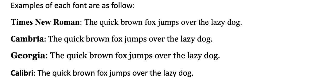
The most common resume fonts are Times New Roman, Cambria, Georgia, and Calibri. Size 11-12 is the recommended font size for the body, and headings may be slightly larger. Never go below size 10.5 as it is difficult to read, and always make use of italics and bold to best utilize your font.
Why is using the correct font so important?
Using a proper font is important because employers rarely spend a long time reading each and every resume they receive.
A resume needs to be easy to scan through at a glance to best improve your chances of being hired, and having a legible font is a large part of that.
Fonts that are too stylized, such as being curly, too small, or too thin, look unprofessional. There is also a chance a custom font may not read well when sent via e-mail.
Stick to the typical fonts, which are tried and true, to avoid coming off as childish or inconsiderate to a potential employer.
While some are more common than others in certain industries, using any of the fonts listed above is acceptable for any job.
Can you mix and match fonts on a resume?
You are not necessarily limited to a single font on a resume. However, it is the best practice to have only one main font on a resume. The body of a resume should be all the same font type regardless of section.
The headings in a resume may be in the same font as the body but made larger or made bold, or it may be a similar font of the same style. Let’s compare examples of a 1-font resume section and a 2-font resume section.
For a 1-font resume, let’s look at a section written only using the Georgia font.

Compare this to the same section using two different fonts, Cambria for the heading and Calibri for the body text:

It comes across perfectly fine with either one or two fonts, but do not use any more than two. Wanting a stylish resume is fine, but a resume shouldn’t look like an art project.
Notice that when listing the dates, the font for the numbers also changes. Do not forget to change this, as you don’t want dates written in a different font than their sections.
Keep the font separated with one font for headers, and one font for body text.
Never give two different sections two different fonts, as that makes the resume look less uniform.
Make sure when you are mixing fonts that you format the abbreviations in the same way as the sentence they are in.
Abbreviations also look different depending on the font type, and they are sometimes easily missed.
How to format a resume using a single font
Resumes that use a single type of font should make particular use of bold and italics to keep things looking neat. Bold and italics should be used on both one and two-font resumes, though it is very important for the one-font.
Headings should always be in bold and are usually 1-2 font sizes larger than the body text.
Titles such as school or company names should be either bolded or left as regular text.
Sub-information such as responsibilities, achievements, or dates tend to be italicized.
Italics help the reader to be able to tell the main information from the sub-information, therefore increasing the readability of the resume.
Let’s look at another example of a single font section written in Cambria:
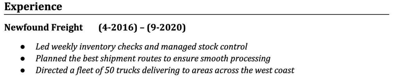
The reader can obtain two crucial pieces of information at a glance: First, the name of the company where you worked. Second, how many years of experience you had at this company.
The goal of formatting your fonts properly is to make this information stand out so that it can be read in a matter of seconds.
Is a 10-point font too small for a resume?
A 10-point font size is considered too small for a resume and should be avoided if possible. If a potential employer has to squint when reading your resume, they may not even bother to try. Make sure that your resume text is large enough to be read easily!
You must also consider why it is you must resort to using a 10-point font.
Is there so much information on your resume that you need to make everything smaller to fit?
If that is the case, you likely have too much information written in the resume.
The best practice is to delete any unnecessary or irrelevant information to stick to the recommended font sizes: 10.5-12.
You must also ensure that your resume has space to make section headers larger than the body text.

Hey fellow Linguaholics! It’s me, Marcel. I am the proud owner of linguaholic.com. Languages have always been my passion and I have studied Linguistics, Computational Linguistics and Sinology at the University of Zurich. It is my utmost pleasure to share with all of you guys what I know about languages and linguistics in general.